
To create a pivot chart in Excel, click any cell in your source data, open the Insert tab, choose PivotChart, pick where the chart should go and click OK. Excel builds the chart and a matching PivotTable at the same time. The rest of this guide covers where that short answer stops being true, platform by platform, with results from our own tests.
Quick Steps
These are the steps Microsoft documents for Excel on Windows:
- Click one cell inside your source table.
- On the Insert tab, click PivotChart.
- Choose where the chart should appear, then click OK.
- In the PivotChart Fields pane, drag fields into Axis (Categories), Legend (Series), Values and Filters.
- Refresh after the source data changes. The chart does not update on its own.
Already have a PivotTable? Click a cell inside it and use Insert, then PivotChart. Working in Excel for the web? You have to build the PivotTable first. On a Mac, read the platform section before trusting any tutorial, Microsoft's included, because our tested build behaved differently from the documentation in two places.
What Is a Pivot Chart?
A pivot chart is an Excel chart whose data comes from a PivotTable instead of a fixed range of cells. Change the PivotTable's fields, filters or grouping and the chart redraws to match. The two stay tied together for as long as both exist.
Pivot Chart vs Regular Chart
The difference shows up the moment you try to edit one like the other.
| Behavior | Pivot Chart | Regular Chart |
|---|---|---|
| Data source | Bound to a PivotTable and its PivotCache | Points at worksheet cells or a named range |
| Select Data Source | The cell range input is locked and grayed out; every series comes from the PivotTable layout | The range can be changed, combined or typed by hand |
| Switch Row/Column | Often unavailable, or it swaps fields between Rows and Columns in the PivotTable | Available straight from the ribbon |
| New categories | Appear automatically when the PivotCache is refreshed | Do not appear unless the source is an Excel Table or a dynamic formula |
| Customization | More limited | More freedom |
LibreOffice Calc backs up the locked-range behavior from a different angle: its pivot chart wizard disables the data range and data series pages outright, because the pivot table controls them.
How the PivotCache Connects Table and Chart
Neither object reads your worksheet directly. When you build a pivot chart from raw data, Excel creates a new PivotCache, a stored copy of the source, and binds both the companion PivotTable and the chart to it. That design explains most of the complaints: new rows stay invisible until you refresh, the chart's range is locked, and several charts can share settings you meant to change once.
One click, two objects
Insert > PivotChart builds a new PivotCache from your source data, then creates a PivotTable and a PivotChart that both read from it.
Sources: Microsoft Support, Create a PivotChart • Arfadia test, Excel for Mac 16.112.3 (Build 26083020), 9 September 2026
Created by Arfadia • arfadia.com/blog
Prepare Your Source Data
Most pivot chart failures start before you click anything. Excel expects one header row, a unique label per column, one record per row, and real numbers and dates.
Platform exports rarely arrive that way. A Google Ads campaign export we examined put "Campaign performance" in row 1, the date range in row 2 and the real header in row 3. It was also tab-separated and encoded as UTF-16LE, which explains why Google Ads exports often look scrambled when opened straight in Excel. Delete the rows above the header first.
Regional settings are the quieter trap. Our test Mac ran Excel with an English interface while the macOS Region was set to Indonesia, where numbers are written 1.234.567,89 and dates run day, month, year. We imported US-formatted exports through File, Import, CSV file and kept the importer's defaults (Excel for Mac 16.112.3, Build 26083020, 8 to 9 September 2026). Google Ads clicks of 4,177 became 4.177, a value just over four. Impressions of 29,490 became 29.49. Search Console positions such as 1.16 turned into clock times like 1:16 in 712 of 1,000 rows, because the period was read as a time separator. A Meta date of 4/1/2026, meaning April 1, came through as January 4.
The menus said English. The number parser said Indonesia. The import wizard did not prevent any of it, so the fix is not a way of opening files. What matters is whether each column's data type is set explicitly during import and whether your regional settings match the file's format. We saw this on a Mac, but the trigger is the regional setting, so check it on whatever machine you use.
Once the data is clean, format it as an Excel Table with Ctrl + T before building the chart. A table grows with new rows, so a refresh picks them up without you editing the source range.
The same data, hard to pivot and ready to pivot
Five source problems that stop a pivot chart or quietly distort it, and the layout Excel expects instead. The rows are illustrative.
Sources: Google Ads campaign report export structure • Arfadia tests, Excel for Mac 16.112.3 (Build 26083020), 9 to 10 September 2026 • Illustrative data
Created by Arfadia • arfadia.com/blog
What Happens When a Column Header Is Blank
On Windows, users widely report that Excel refuses to build the PivotTable and shows this message:
"The PivotTable field name is not valid. To create a PivotTable report, you must use data that is organized as a list with labeled columns. If you are changing the name of a PivotTable field, you must type a new name for the field."
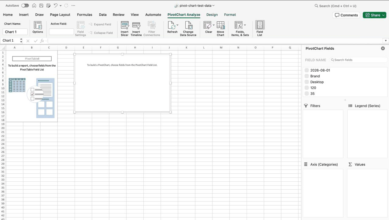
The Mac behaved differently, and worse. In Excel for Mac 16.112.3 (Build 26083020), tested 10 September 2026, we blanked the Device header, clicked one cell inside the table and chose Insert, then PivotChart. There was no error dialog, the PivotChart it built used the first data row as its field names, and that row dropped out of the results without warning. The field list read 2026-08-01, Brand, Desktop, 120 and 35.
Same mistake, two outcomes. Windows stops you at the door. The Mac lets you in and loses a record on the way without a word. Label every column, every time.
Create a Pivot Chart from Raw Data
Microsoft documents the Windows flow in four moves. Click a cell in your table. On the Insert tab, choose PivotChart. Select where the PivotChart should appear and click OK. Then pick the fields to display.
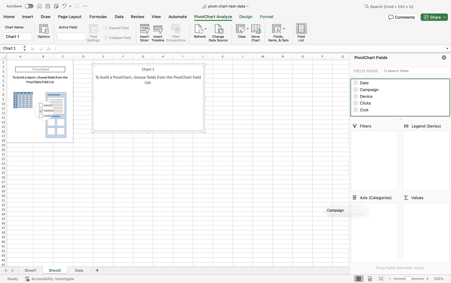
The field list is where the chart takes shape. Drop a category such as Campaign into Axis (Categories), a measure such as Clicks into Values, and a second dimension such as Device into Legend (Series) if you want one series per device. Filters holds anything you want to slice by without plotting it. In our tests the numeric fields arrived in Values as Sum of Clicks and Sum of Cost. Sums suit clicks and cost. They do not suit ratios such as CTR, which we come back to under calculated fields.
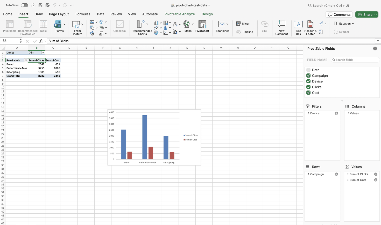
On Mac, the same Insert, PivotChart path worked from a raw data cell in our tests, even though Microsoft's page says it should not. The platform section has the screenshots.
| Task | Starting Selection | Ribbon Path | Dialog Shown | Objects Created |
|---|---|---|---|---|
| From raw data, Windows | One cell in the source table | Insert, PivotChart | A location prompt; its name is not documented in our sources | PivotTable and PivotChart (reported) |
| From raw data, Mac | One cell in the source table | Insert, PivotChart | Create PivotChart (tested 9 September 2026) | PivotTable and PivotChart (tested 9 September 2026) |
| From a PivotTable, Windows | One cell inside the PivotTable | Insert, PivotChart; PivotTable Analyze, Tools, PivotChart is also reported | A chart type choice; its name is not documented in our sources | PivotChart only |
| From a PivotTable, Mac | One cell inside the PivotTable | Insert, PivotChart, or PivotTable Analyze, PivotChart | Not captured in our test | PivotChart only |
| From a PivotTable, web | One cell inside the PivotTable | Insert, Insert Chart dropdown | No dialog documented; a Chart tab appears once the chart is selected | Chart only |
The Companion Pivot Table Excel Builds Automatically
Starting from raw data, you never ask for a PivotTable, and you get one anyway. Excel places an empty PivotTable next to a blank chart canvas, and every field you drop into the PivotChart Fields pane fills both.
We watched it happen on the Mac: one action produced a PivotTable and a PivotChart on the same new sheet (Excel for Mac 16.112.3, Build 26083020, 9 September 2026). On Windows this is reported by practitioners rather than tested by us.
Leave that PivotTable alone. If you delete it, the chart loses its connection to the cache and turns into a static chart with hardcoded values, according to widely shared user reports. If it clutters a report, move it to its own sheet and hide the sheet.
Create a Pivot Chart from an Existing Pivot Table
If the PivotTable already exists, Microsoft's instructions are short: click a cell inside the PivotTable, go to Insert, choose PivotChart, pick a chart and click OK. This time Excel creates only the chart. It reads the same PivotCache as the table and stays linked to it.
Three tutorial sites also describe a second route on Windows desktop builds: PivotTable Analyze, then the Tools group, then PivotChart. Microsoft's page does not mention it, so treat Insert as the official path and this one as commonly reported. On the Mac we can be more definite. Both routes exist there: the PivotChart button sits on the Insert tab and on the PivotTable Analyze tab (Excel for Mac 16.112.3, Build 26083020, 9 September 2026).
The link runs both ways, as users report it. Filter the chart and the PivotTable filters too. Rearrange the PivotTable and the chart follows. If one PivotTable drives several charts, a layout or filter change hits all of them at once, which is worth knowing before you share a workbook.
The chart joins a PivotTable you already have
Excel ties the new chart to the existing PivotTable in both directions. Google Sheets draws an ordinary chart over the pivot table's output cells instead.
Sources: Microsoft Support, Create a PivotChart • Google Docs Editors Help, pivot tables and charts • community reports • Arfadia test, Excel for Mac 16.112.3 (Build 26083020), 9 September 2026
Created by Arfadia • arfadia.com/blog
Keyboard Shortcuts by Platform
On Windows, Alt + F1 is reported to create an embedded chart and F11 a chart on its own sheet. Alt + F5 is reported to refresh the selected PivotTable and Ctrl + Alt + F5 to refresh everything in the workbook. We have not tested any of these on Windows.
Do not assume they carry over to the Mac. On the Mac build we tested, F11 and Option+F11 triggered the system volume controls instead of creating a chart sheet (Excel for Mac 16.112.3, Build 26083020, 10 September 2026). Use the ribbon there.
Mac, Web, and Mobile: What the Docs Say vs What We Found
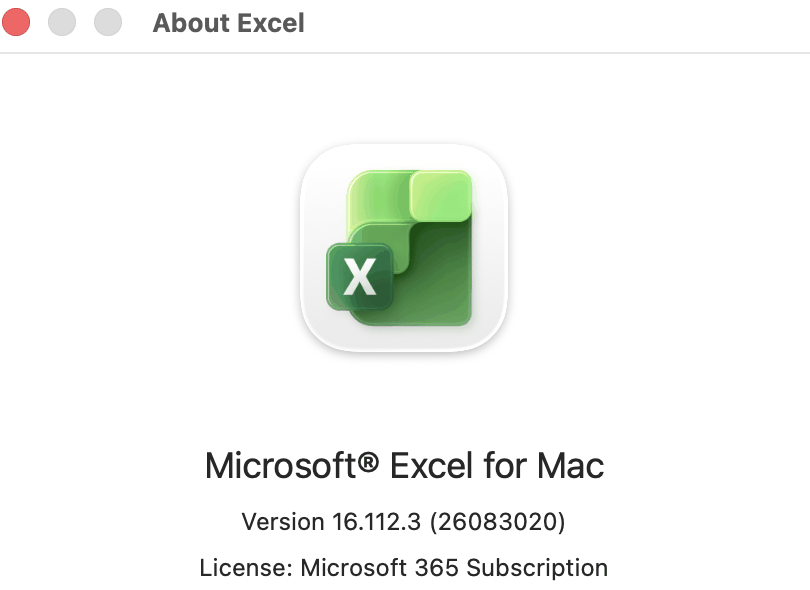
Every test result in this article comes from one machine: Microsoft 365 for Mac, Version 16.112.3 (Build 26083020), tested 8 to 10 September 2026. We did not test Windows, Excel for the web or any mobile app. Where a claim rests on Microsoft's documentation or on community reports, we say so.
What each platform can do with a pivot chart
Heavy outlines mark what we tested ourselves. Everything else comes from vendor documentation or community reports, and the gaps stay visible instead of being guessed.
Sources: Microsoft Support, Create a PivotChart • Microsoft Excel Blog, PivotTables on iPad • Google Docs Editors Help • LibreOffice Help, pivot chart guide • Arfadia tests, Excel for Mac 16.112.3 (Build 26083020), 8 to 10 September 2026
Created by Arfadia • arfadia.com/blog
Excel for Mac Has a PivotChart Button on the Insert Tab
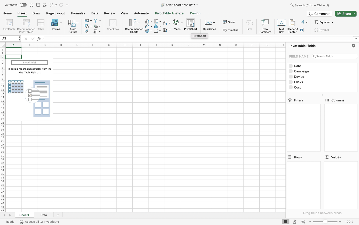
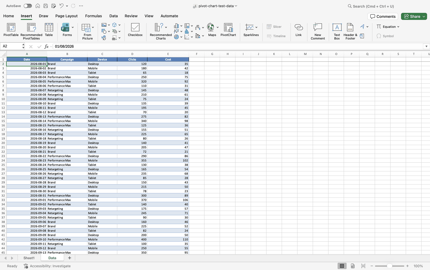
As of 10 September 2026, Microsoft's Create a PivotChart page still tells Mac users to create a PivotTable first and then insert a chart. Our test found something else. In Excel for Mac 16.112.3 (Build 26083020), the Insert tab carries a PivotChart button right beside PivotTable, Recommended PivotTables, Table, Maps, Sparklines, Slicer and Timeline (8 September 2026).
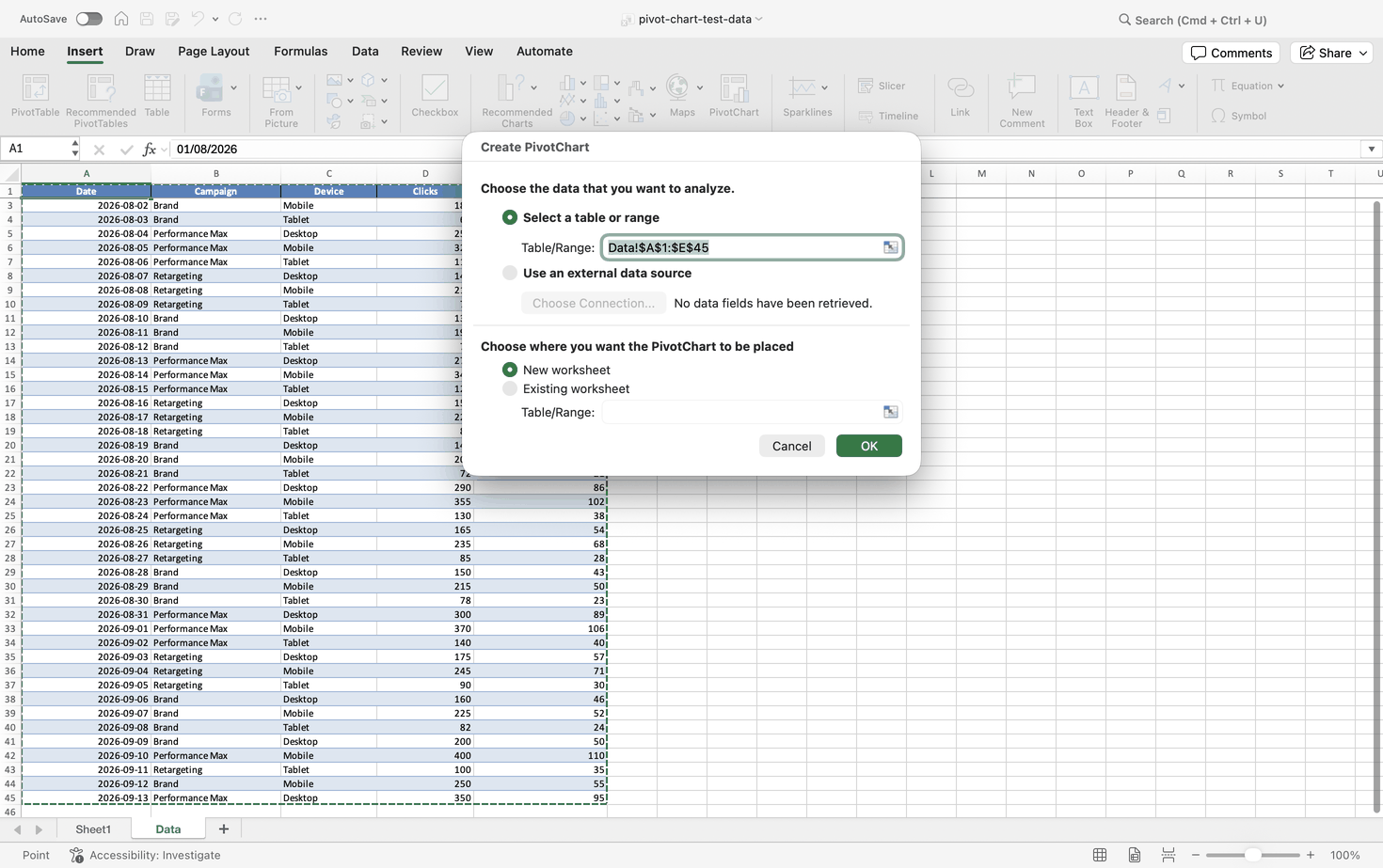
It also works from raw data. With one plain data cell selected and no PivotTable anywhere near it, we clicked Insert, then PivotChart. Excel opened a dialog titled Create PivotChart with the range $A$1:$E$45 filled in, and after OK it created the PivotTable and the chart together (9 September 2026). The PivotTable Analyze and Design contextual tabs were there too.
This is a result from one build, not a verdict on the documentation. Check your own version in the About Excel window, and if the button is missing, follow Microsoft's route.
Combo Charts Work on Mac Despite the Documentation
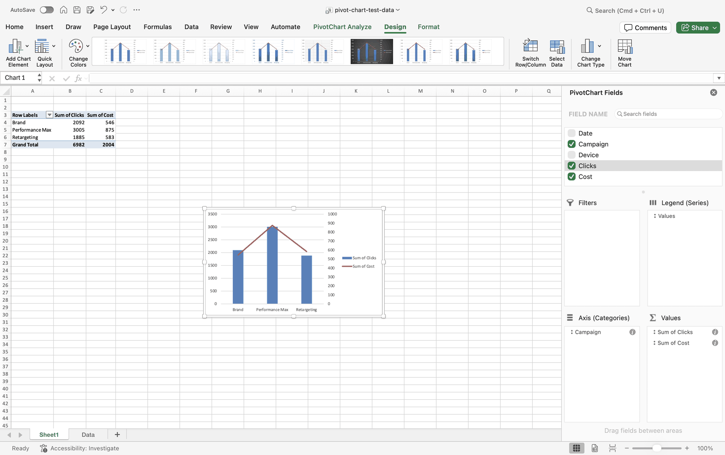
Microsoft's Mac instructions say combo charts do not work with PivotTables yet. In our test they did. We plotted Sum of Clicks as clustered columns on the left axis and Sum of Cost as a line on a secondary axis on the right, and it worked fully (Excel for Mac 16.112.3, Build 26083020, 8 September 2026).
For ordinary 2-D charts, Microsoft documents that changing one series to a different chart type produces a combination chart. That page does not discuss pivot charts, so read it as background, not as confirmation.
Excel for the Web: Capabilities and Gaps
Microsoft does not document a direct raw-data route in the browser. Build the PivotTable first, click a cell inside it, open the Insert tab and choose a chart from the Insert Chart dropdown. Once you click the chart, a Chart tab appears in the ribbon for editing.
Chart choice is narrow. Only column, line, pie and radar charts work with pivot tables on the web; treemap, statistical and combo charts do not. Field buttons are reported not to render on the web canvas, though we have not checked that ourselves.
iPad, iPhone, and Android
Microsoft does not document how to create a PivotChart in the Excel apps for iPad, iPhone or Android. That is different from saying it cannot be done, and we have not tested it. What is documented: PivotTables reached the iPad in January 2024 and need version 2.80.1203.0 or later. That covers PivotTables, not charts. If a tablet is part of your reporting routine, test a pivot chart on it before you depend on one.
Google Sheets and LibreOffice Calc
Google Sheets has no native pivot chart object. Google documents pivot tables and charts as two separate operations, so the honest phrase is "create a chart from a pivot table in Google Sheets". Select your raw cells, choose Insert, then Pivot table, and set Rows, Columns, Values and Filters. Then select the result range, choose Insert, then Chart, and adjust it in the Chart editor. The pivot table refreshes itself when its source cells change, unlike Excel's.
The chart is another matter. Users report that it only reads the pivot table's output cells, has no field buttons, and does not widen when the pivot table grows unless you set an open-ended range such as A3:C by hand. Pivot tables are also reported to be creatable only in Sheets on a desktop browser, not in the mobile app.
LibreOffice Calc sits closer to Excel. There is no documented raw-data route, so build the pivot table first with Insert, then Pivot Table. Click a cell inside it and choose Insert, then Chart, or the Insert Chart icon on the toolbar. Calc recognizes the pivot table and opens a Pivot Chart wizard; pick a chart type and click OK. The wizard's data range and data series pages are disabled because the pivot table controls them, and the finished chart carries field filter drop-downs on the canvas, much like Excel's field buttons.
Chart Types: What Works and What Fails
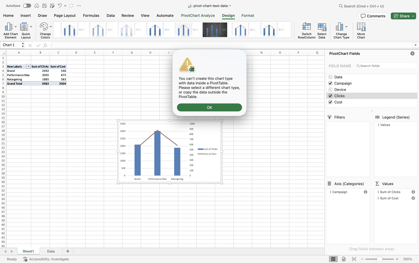
Pivot charts cannot use every chart type Excel offers. On the Mac we tried nine and all nine were blocked: XY Scatter, Bubble, Stock, Treemap, Sunburst, Histogram, Box and Whisker, Waterfall and Funnel (Excel for Mac 16.112.3, Build 26083020, 8 September 2026). Each attempt produced the same message:
"You can't create this chart type with data inside a PivotTable. Please select a different chart type, or copy the data outside the PivotTable."
Windows users report different wording for the same wall:
"The chart type you have selected cannot be used for a PivotChart report, which is a chart created with PivotTable data."
Why? A MrExcel discussion offers a partial answer: a scatter chart's X axis is always numeric and pivot charts are not built to validate the X-axis data type, while bubble and stock charts need a fixed data layout that clashes with a table designed to be rearranged. That covers three types. We found no reliable explanation for the rest.
The workaround is the one the Mac message suggests. Copy the summarized values outside the PivotTable and build a regular chart from the copy. You lose the live link, so repeat the copy after each refresh. For combo charts, which do work, see the Mac section above.
In the table below, "Not documented in our sources" means exactly that: we found no source covering it, and we did not test Windows.
| Chart Type | Windows | Mac | Web | Google Sheets Equivalent | Source |
|---|---|---|---|---|---|
| Column | Not documented in our sources | Works (tested) | Works | Google Sheets has no pivot chart object. Any chart you add reads the pivot table's output cells as a regular chart; support for each type is not documented in our sources. | Our Mac test; Microsoft (web) |
| Line | Not documented in our sources | Works as part of a combo (tested) | Works | Our Mac test; Microsoft (web) | |
| Pie, Radar | Not documented in our sources | Not tested | Works | Microsoft (web) | |
| Combo | Works (reported) | Works (tested) | Does not work | Our Mac test; Microsoft (web); user reports | |
| XY Scatter | Blocked (reported) | Blocked (tested) | Not among the supported types | Our Mac test; MrExcel; Microsoft (web) | |
| Bubble | Blocked (reported) | Blocked (tested) | Not among the supported types | Our Mac test; MrExcel; Microsoft (web) | |
| Stock | Blocked (reported) | Blocked (tested) | Not among the supported types | Our Mac test; MrExcel; Microsoft (web) | |
| Treemap | Not documented in our sources | Blocked (tested) | Does not work | Our Mac test; Microsoft (web) | |
| Sunburst | Not documented in our sources | Blocked (tested) | Does not work | Our Mac test; Microsoft (web) | |
| Histogram, Box and Whisker | Not documented in our sources | Blocked (tested) | Does not work | Our Mac test; Microsoft (web) | |
| Waterfall, Funnel | Not documented in our sources | Blocked (tested) | Does not work | Our Mac test; Microsoft (web) |
Customize and Clean Up Your Pivot Chart
Styling happens on the Design and Format tabs that appear when the chart is selected. The data side is where habits need to change.
Sorting is the first surprise. You cannot sort categories on the chart itself; right-click a category cell in the PivotTable, choose Sort, then Sort Largest to Smallest, and the chart follows. Number formats are the second. Set them through Value Field Settings, then Number Format, inside the PivotTable instead of on the Home tab, so the format belongs to the field. Both tips come from user reports; we did not test them.
How to Hide Field Buttons (and Why Mac Users Never See Them)
Field buttons are the interactive controls Excel draws on a pivot chart's surface. They mirror the fields in the Axis, Legend, Report Filter and Values zones.
People hide them for plain reasons, according to user reports: they take space, they look messy in an executive layout, their styling cannot be controlled, and they duplicate what a slicer already does. On Windows, select the chart, open PivotChart Analyze, and in the Show/Hide group toggle Field Buttons; its dropdown can hide one category at a time. Three independent tutorials describe that path. In VBA, ActiveChart.ShowAllFieldButtons = False hides them all and ActiveChart.ShowAxisFieldButtons = False hides only the axis buttons. Those properties are documented from Excel 2010 onward and do not exist in Excel 2007.
On the Mac there is nothing to hide. Our pivot charts showed no field buttons at all (Excel for Mac 16.112.3, Build 26083020, 9 September 2026), which matches what Microsoft says about Mac pivot charts. Filter through the PivotTable or a slicer instead.
Does Formatting Survive a Refresh? We Tested It
Lost formatting after a refresh fills the forums, and the usual assumption is that a refresh wipes custom styling. On our Mac it did not.
We started with a chart carrying four manual changes: one bar colored red by hand, a typed title reading "Clicks per Campaign", a data label (it read 3005) and a secondary axis. Then we ran two scenarios on Excel for Mac 16.112.3 (Build 26083020), 8 September 2026. First, we added rows to the source and refreshed. Second, we moved the Device field into Filters. Nothing reset in either case. The red bar stayed red, the title stayed, the secondary axis stayed, and the data label updated from 3005 to 3755 as the new rows came in.
| Scenario | Custom Series Color | Manual Title | Data Label | Secondary Axis | Tested Build |
|---|---|---|---|---|---|
| Add rows, then refresh | Kept | Kept | Kept, updated from 3005 to 3755 | Kept | 16.112.3 (Build 26083020), 8 September 2026 |
| Move Device to Filters | Kept | Kept | Kept | Kept | 16.112.3 (Build 26083020), 8 September 2026 |
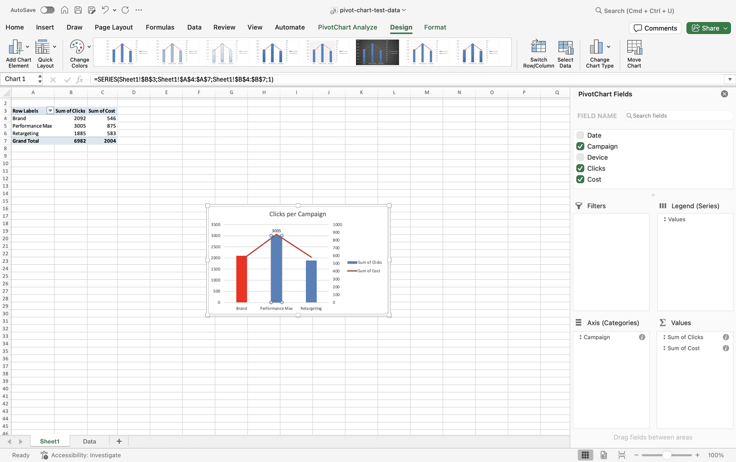
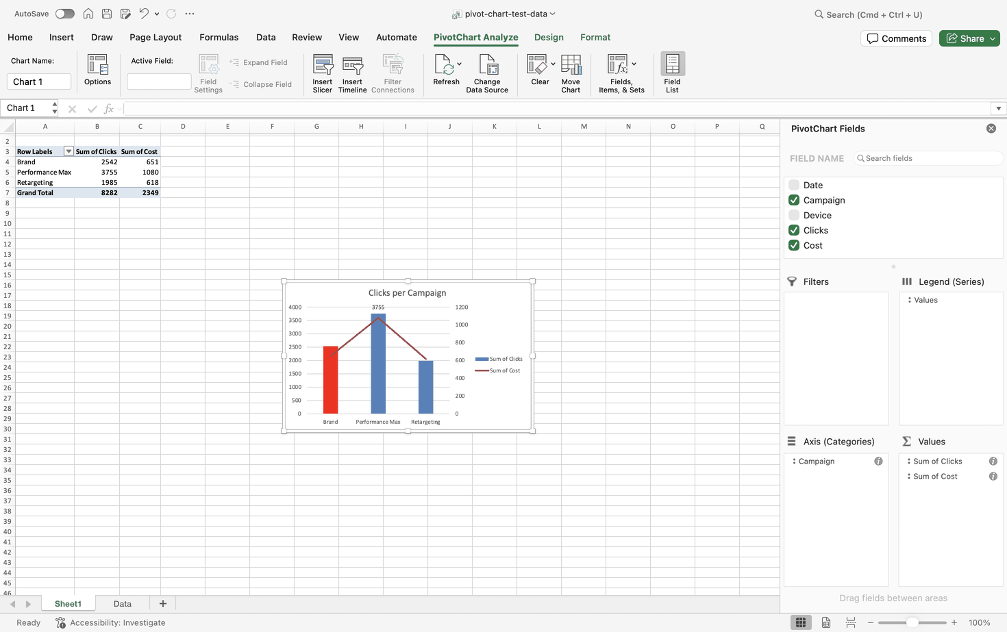
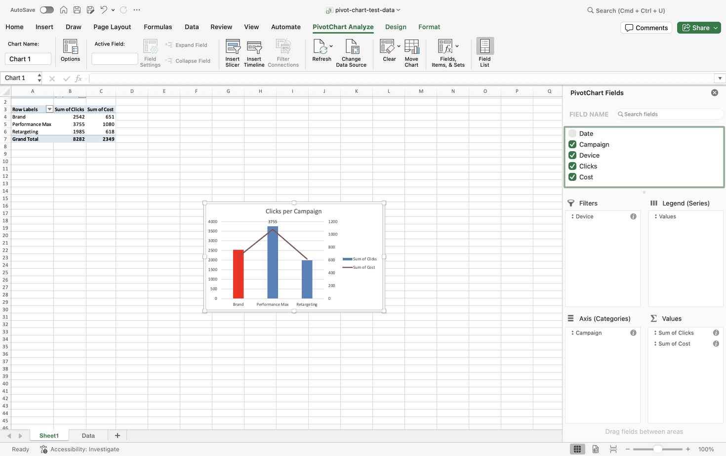
Two clean scenarios on one Mac build are not proof that the problem is gone everywhere. The widespread reports come mainly from older Windows builds, including a Microsoft community thread about Excel 2016 pivot charts losing their formatting. The mechanism users describe runs like this: a pivot chart is a projection of the PivotCache, a refresh redraws the canvas, and if the set or order of series changes, Excel cannot map the saved formatting and falls back to the workbook's theme palette. Another reported symptom: a slicer that changes the chart's colors every time a different month is clicked. Test your own build before you trust either outcome.
Why custom chart formatting can reset
This is the chain users describe when a refresh wipes their colors. On the Mac build we tested, neither of our two test scenarios set it off.
Preserve cell formatting on update
Tick it in PivotTable Options, on the Layout & Format tab. Reported to help, not a guarantee that chart formatting survives.
Set number formats in the PivotTable
Use Value Field Settings, then Number Format, instead of the Home tab, so the format belongs to the field.
Save the chart as a template
Right-click the finished chart and choose Save as Template, so a reset chart can be restyled in one step.
VBA as the last resort
Reapply formatting from the Worksheet_PivotTableUpdate event. Worth it only when the other three fail.
On the Mac build we tested, the chain did not run
Excel for Mac 16.112.3 (Build 26083020), 8 September 2026. We added rows and refreshed, then moved Device to Filters. Both times a custom bar color, a manual title, a data label and a secondary axis stayed in place. The widespread complaints come from older Windows builds, so test your own build before relying on either result.
Sources: practitioner reports on PivotChart formatting after refresh • Microsoft community Q&A threads • Arfadia test, Excel for Mac 16.112.3 (Build 26083020), 8 September 2026
Created by Arfadia • arfadia.com/blog
Add Slicers and Timelines
Slicers turn a pivot chart into something a colleague can use without opening the field list. Select the PivotTable, go to PivotTable Analyze, and in the Filter group choose Insert Slicer. Tick the dimensions you want as buttons, such as Campaign or Device, and click OK.
Timelines do the same job for dates. Choose Insert Timeline and pick a date field. If the date column holds text dates or empty cells, Excel is reported to block the timeline, which is one more reason to fix dates before you build anything. On the Mac, the Slicer and Timeline buttons also sit on the Insert tab (Excel for Mac 16.112.3, Build 26083020, 8 September 2026).
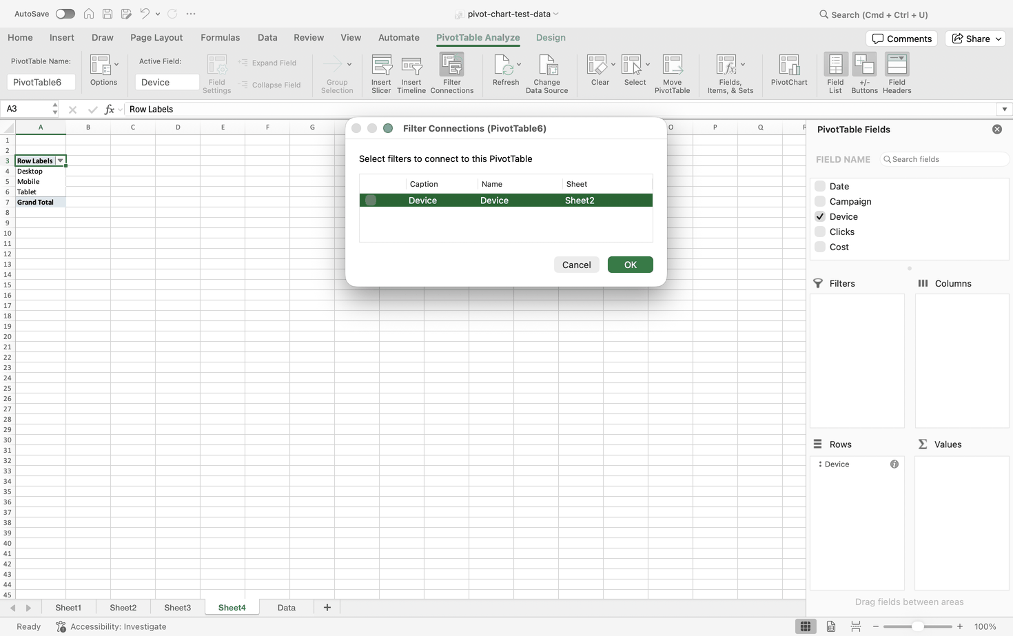
The real value comes when one slicer drives several charts. On Windows, users describe right-clicking the slicer, choosing Report Connections and ticking every PivotTable behind the dashboard. The Mac names it differently. What we found there is Filter Connections, a button on the PivotTable Analyze tab that opens a dialog for the selected PivotTable and lists the slicers you can connect to it (Excel for Mac 16.112.3, Build 26083020, 9 September 2026). Same idea, different name, and in our test it opened from the PivotTable side rather than from the slicer. If you follow a Windows tutorial on a Mac and look for Report Connections, you will not find it.
If the PivotTable you want is missing from either list, it was most likely built from a separate copy of the source range and does not share a cache with the others. Rebuild it by copying the main PivotTable, as described in the next section.
Build a Multi-Chart Dashboard
A dashboard is several pivot charts reading one PivotCache, so one refresh and one set of slicers move everything together. Getting a shared cache is less obvious than it sounds. Practitioners recommend building one base PivotTable and then copying and pasting it for each extra chart. A new PivotTable built from the same range can end up with its own cache, and then your slicers stop reaching it.
Sharing a cache has two side effects that catch people out, according to user reports. Calculated items spread: create one in any PivotTable and it appears in every table on the same cache. Grouping is synchronized too, so grouping dates by month and year in one PivotTable groups them that way everywhere. If one chart needs weekly dates and another monthly, give them separate caches or prepare the data in Power Query.
Microsoft does not set a maximum number of charts per dashboard. The documented limit is available memory. What users report as a hard rule is different: one pivot chart cannot draw from two independent PivotTables at the same time. To put two sources in one chart, combine them first in Power Query or the Data Model, or build a helper range with GETPIVOTDATA and chart that.
Calculated Fields vs Calculated Items
Both live under PivotChart Analyze, Calculations, then Fields, Items, & Sets, and they solve different problems.
| Dimension | Calculated Field | Calculated Item |
|---|---|---|
| Works across | Columns or fields | Items inside one field |
| Aggregation logic | Sums the components first, for example SUM(A) / SUM(B) | Calculates directly between items |
| Report Filter | Fully supported | Blocked |
| Used more than once in Values | Supported | Blocked |
| How it shows on the chart | A standard data series | An extra category data point on the axis |
The aggregation row matters most for marketing data. A calculated field sums its parts before applying the operator, as users describe it. A field defined as Cost / Conversions returns SUM(Cost) / SUM(Conversions), not an average of row-by-row cost per acquisition. That is exactly why it gives the correct answer for ratios such as CPC and ROAS.
One catch. If you tick Add this data to the Data Model when creating the PivotTable, classic calculated fields and items are reported to be disabled. You write a DAX measure instead, for example CTR := DIVIDE(SUM([Clicks]), SUM([Impressions])).
When You Need Power Pivot
Use the Data Model and Power Pivot when you need relationships between tables, measures you can reuse, a distinct count, or more rows than the grid holds. Skip it for a single flat export that fits on a worksheet and only needs sum, count, average or grouping. Microsoft itself suggests leaving Add this data to the Data Model unticked when you do not need complex relationships, because it makes the file larger.
For several sheets with the same structure, append them in Power Query and add a column that records the source or period. For relational tables, such as campaigns, ad sets and daily performance, load each one into the Data Model and relate them through a stable key. The old Multiple Consolidation Ranges wizard (Alt + D + P) is reported to be outdated and limited to a two-variable crosstab.
Marketing Reporting Examples
This is where pivot charts earn their keep in agency work. Every header below comes from a real platform export we examined, not from memory. Header names belong to the platform, so they are safe to show; the account data behind them is not, and none of it appears here.
| Platform | Exported Header | Data Type | Pivot Area | Recommended Aggregation | Caution |
|---|---|---|---|---|---|
| Google Search Console | Top queries | Text | Rows | None | The Queries tab export has no page column |
| Google Search Console | Clicks | Number | Values | Sum | |
| Google Search Console | CTR | Percentage | Values | Recalculate as clicks divided by impressions | Summing a ratio gives a meaningless number |
| Google Search Console | Position | Decimal | Values or Filters | Treat averages as indicative only | Read as a clock time under day-first regional settings in our test |
| Google Ads | Campaign state | Text | Filters | None | It is state, not status |
| Google Ads | Clicks | Number | Values | Sum | 4,177 was read as 4.177 under an Indonesian Region setting |
| Google Ads | Cost | Currency | Values | Sum | Check the Currency code column before mixing accounts |
| Google Ads | Conversions | Decimal | Values | Sum | |
| Google Ads | Cost / conv. | Currency | Values | Recalculate as cost divided by conversions | A ratio; do not sum |
| Meta Ads | Reporting Starts | Date | Axis or Filters | None | A US-style date was read day first in our test |
| Meta Ads | Campaign Name | Text | Axis or Rows | None | |
| Meta Ads | Amount Spent (IDR) | Currency | Values | Sum | The currency is part of the column name |
| Meta Ads | Link Clicks | Number | Values | Sum | |
| Meta Ads | CTR (Link Click-Through Rate) | Percentage | Values | Recalculate from link clicks and impressions | A ratio; do not sum |
| Meta Ads | Indikator hasil (awal) | Text | Filters | None | The only Indonesian header in an otherwise English file |
| GA4 (example) | Session default channel group | Text | Axis or Legend | None | GA4 headers vary by report and export method |
| GA4 (example) | Sessions | Number | Values | Sum | Validate names against the GA4 API schema |
Google Search Console Striking Distance Report
Start with the export limit. A Search Console query export we ran in September 2026 returned exactly 1,000 rows of query data. That is the ceiling of the web interface export per tab. For the full dataset you need the Search Console API, Looker Studio, a Sheets add-on, or the Bulk Data Export to BigQuery.
The classic striking-distance setup, as practitioners describe it, puts Landing Page in Rows, Search Query in Columns, SUM of Clicks and SUM of Impressions in Values, and filters Average Position to 11 through 30. That needs page and query in one dataset. The Queries tab export we examined had no page column, so this report needs an API or BigQuery pull rather than a UI download.
Two more views work well from the same data. A combo chart with impressions as columns and CTR as a line on a secondary axis surfaces queries with high impressions and weak CTR. A chart of ranking tiers over time, positions 1 to 3, 4 to 10, 11 to 20 and 21 and beyond, shows whether a site is moving up or just holding. If you would rather hand this work to specialists, our look at the top SEO agencies in Indonesia compares who does it.
GA4 Channel Acquisition
GA4 has no single universal header set. Column names depend on the report, the dimensions and metrics, the locale and the export method. Fields such as Date, Session default channel group, Session source / medium, Landing page + query string, Device category, Country, Active users, Sessions, Engaged sessions, Key events and Total revenue are examples reported in exports, not a guarantee. Check yours against the GA4 Data API schema before building a template around them.
A useful first chart puts Session default channel group on the axis with Sessions and Key events as values, as a stacked column. It shows which channels bring volume and which bring outcomes.
Google Ads and Meta Ads Spend Pacing
Pacing means spend per campaign per day across both platforms, drawn as a line chart. The exports fight you on the way.
Google Ads: the column is Campaign state, not Campaign status, so a template written from memory breaks on the first lookup. The file is tab-separated UTF-16LE with two junk rows above the header. Meta Ads: the currency sits inside the column name, as in Amount Spent (IDR) and CPC (Cost per Link Click) (IDR), so a template built on one account's column names breaks on an account in another currency. The Ends column sits in the middle of the file, between Amount Spent and Impressions, not next to Reporting Ends. And the last column, Indikator hasil (awal), arrived in Indonesian while every other header was English, a locale leak inside a single file.
The campaign-level exports we examined held one row per campaign for the whole period. Daily pacing needs a daily breakdown, so choose it before exporting, and export at ad set level if you need that detail.
When to Switch to Looker Studio, Power BI, or Tableau
Excel pivot charts are a working tool, not a reporting platform. The table sets out where each option fits, in our editorial judgment.
| Requirement | Excel Pivot Chart | Looker Studio | Power BI or Tableau | Recommended Choice |
|---|---|---|---|---|
| Ad hoc exploration of a local file, with quick calculations beside the chart | Best fit | Not the main fit | Not the main fit | Excel Pivot Chart |
| Sensitive data that must stay local | Best fit | Not the main fit | Not the main fit | Excel Pivot Chart |
| Datasets under about 100,000 rows | Best fit | Not the main fit | Not the main fit | Excel Pivot Chart |
| Automatic API connection to GA4, Search Console, Google Ads or BigQuery, no manual downloads | Not the main fit | Best fit | Not the main fit | Looker Studio |
| Sharing reports with clients through access-controlled links | Not the main fit | Best fit | Not the main fit | Looker Studio |
| Data warehouse connections, millions of rows, a multi-table star schema, advanced DAX or row-level security | Not the main fit | Not the main fit | Best fit | Power BI or Tableau |
Reporting that feeds several teams at once is where a single workbook starts to strain. The same need shows up in go-to-market intelligence work, where dashboards feed product, sales and marketing at once. Move when the refresh routine, not the chart, becomes the bottleneck.
Troubleshooting
The problems below fall into three groups: the source data, the cache, and platform differences. The table collects symptoms from forum threads and from our own tests, with the evidence behind each fix.
| Symptom or Exact Error | Cause | Fix | Applies To |
|---|---|---|---|
| PivotChart button is grayed out | Several sheet tabs selected at once (the title bar shows [Group]); an old .xls workbook; a cell or the formula bar still in edit mode; a protected workbook structure | Right-click a sheet tab and choose Ungroup Sheets; save as .xlsx, .xlsm or .xlsb and reopen; press Enter or Esc; use Review, then Unprotect Workbook | Windows, reported |
| "The PivotTable field name is not valid..." | A source column has no header | Give every column a unique, non-empty text header; unmerge merged headers and label each column | Windows, reported |
| No error, but field names look like data and one row is missing | A blank header; Excel for Mac promoted the first data row to field names | Label every column, then rebuild the PivotTable | Mac, tested 10 September 2026 |
| Numbers or dates look wrong after importing a CSV | Regional settings read commas, periods and day-first dates differently from the file | Set each column's data type during import and match the Region to the file format | Any platform; seen on Mac with Region set to Indonesia, 8 to 9 September 2026 |
| Chart does not update after the source changes | Excel reads the PivotCache, not the grid; new rows outside a static range are missed | Alt + F5 refreshes the selection and Ctrl + Alt + F5 everything; format the source as an Excel Table with Ctrl + T, or use PivotTable Analyze, then Change Data Source | Windows shortcuts reported |
| Formatting lost after a refresh | Series set or order changed, so saved formatting cannot be mapped | See the formatting section and the mitigations above | Mac: kept in two tests, 8 September 2026; Windows: reported |
| Slicer filters one chart but not another | The other chart uses a different PivotCache, or its connection is off | Report Connections on Windows, Filter Connections on Mac; if a table is missing, rebuild it by copying the main PivotTable | Windows reported; Mac name tested 9 September 2026 |
| Timeline cannot be created | The date column holds text dates or empty cells | Convert to real dates, refresh, then insert the timeline | Reported |
| Calculated Field is grayed out | The data was added to the Data Model | Write a DAX measure instead | Reported |
| Select Data is locked | The chart takes its structure from the PivotTable layout | Change the PivotTable layout, not the chart range | Reported |
| Categories cannot be sorted on the chart | Sorting is not available on the visual | Right-click a category cell in the PivotTable, then Sort, then Sort Largest to Smallest | Reported |
| Chart turned static after deleting the PivotTable | The chart lost its cache connection and kept hardcoded values | Keep the PivotTable; move it to its own sheet and hide the sheet | Reported |
| "You can't create this chart type with data inside a PivotTable..." | The chart type is not supported for pivot charts | Copy the data outside the PivotTable and build a regular chart | Mac, tested 8 September 2026; Windows wording differs, reported |
A pattern worth noticing: several rows above are source data problems wearing a chart costume. If a pivot chart misbehaves and the cause is not obvious, check the headers, the data types and the regional settings before anything else.
Limits and Specifications
Microsoft publishes the hard ceilings on its Excel specifications and limits page. These are the ones that touch pivot charts.
| Object | Maximum | Qualifier | Source |
|---|---|---|---|
| Worksheet rows by columns | 1,048,576 by 16,384 | Microsoft specifications | |
| Unique items per field | 1,048,576 | Microsoft specifications | |
| Row or column fields in a PivotTable report | Limited by available memory | Microsoft specifications | |
| Report filters in a PivotTable report | 256 | May be limited by memory | Microsoft specifications |
| Value fields in a PivotTable report | 256 | Microsoft specifications | |
| Report filters in a PivotChart report | 256 | May be limited by memory | Microsoft specifications |
| Value fields in a PivotChart report | 256 | Microsoft specifications | |
| Calculated item formulas in a PivotChart report | Limited by available memory | Microsoft specifications | |
| PivotTable reports per sheet | Limited by available memory | Microsoft specifications | |
| Charts linked to a worksheet | Limited by available memory | Microsoft specifications | |
| Data series in one chart | 255 | Microsoft specifications | |
| Worksheets referred to by one chart | 255 | Microsoft specifications | |
| Items shown in a filter drop-down list | 10,000 | Microsoft specifications | |
| MDX name length for a PivotTable item | 32,767 | Microsoft specifications |
The Data Model has its own constraint. In a 32-bit environment, Excel, the workbook and any add-ins share 2 GB of virtual address space, and the Data Model's share can reach 500 to 700 MB, less if other models or add-ins are loaded. A 64-bit install has no hard file-size limit and is bounded only by memory and system resources. Since Excel 2016, Large Address Aware lets 32-bit Excel use twice the memory on 64-bit Windows.
One limit is missing from Microsoft's list: a pivot chart drawing from two independent PivotTables at once. Users report that it cannot. Treat that as reported rather than specified; the workarounds in the dashboard section still apply.
Performance: When Excel Starts to Struggle
Microsoft publishes no benchmark for how long a PivotTable or pivot chart takes to refresh at a given row count. We looked, including the specifications page, and found none. Refresh times quoted in seconds come from someone's machine, not from a specification.
What practitioners commonly report is a slowdown somewhere between 100,000 and 500,000 rows, far below the 1,048,576-row ceiling, and a general recommendation to move to the Data Model above roughly 200,000 rows. Treat both as rules of thumb. Refresh speed depends on your hardware, 32-bit or 64-bit Excel, data types, the number of unique values in each field, how many calculated fields you use, how many pivots and charts share the workbook, and how the source is connected.
If a workbook drags, work through that list before buying a faster laptop: fewer calculated fields, fewer pivots and charts per workbook, one shared cache for a dashboard instead of five, 64-bit Excel where you can, and the Data Model once you pass the ranges above.
Frequently Asked Questions
How do I create a pivot chart in Excel?
Click one cell in your source data, open the Insert tab, choose PivotChart, pick where it should go and click OK. Then drag fields into Axis, Legend, Values and Filters in the PivotChart Fields pane. Excel creates a matching PivotTable at the same time.
What is the difference between a pivot chart and a regular chart?
A pivot chart takes its data from a PivotTable and its PivotCache, so its data range is locked and its series follow the PivotTable layout. A regular chart points at worksheet cells, which you can edit freely, but it does not pick up new categories on its own.
Can I create a pivot chart without making a PivotTable first?
On Windows, Microsoft documents Insert, then PivotChart straight from raw data. On the Mac, our test of Excel for Mac 16.112.3 (Build 26083020) on 9 September 2026 worked the same way, although Microsoft's page still says Mac users need a PivotTable first. On the web, you need the PivotTable first.
How do I create a pivot chart on a Mac?
In our tested build, select one cell in your data and choose Insert, then PivotChart. A Create PivotChart dialog opens. If your Insert tab has no PivotChart button, build a PivotTable first and insert a chart from it, as Microsoft documents.
Can I create a pivot chart in Excel for the web?
Yes, from an existing PivotTable. Click a cell inside it, open Insert and choose a chart from the Insert Chart dropdown. Only column, line, pie and radar charts work with pivot tables on the web. Microsoft does not document a raw-data route.
Can I make a pivot chart on an iPad or phone?
Microsoft does not document PivotChart creation in the Excel apps for iPad, iPhone or Android, and we have not tested it. PivotTables came to the iPad in January 2024 in version 2.80.1203.0 or later, but that documentation covers tables, not charts.
Does Google Sheets have pivot charts?
Not as a native object. You create a pivot table, then build a regular chart from its output cells. The chart has no field buttons and, according to users, only grows with the pivot table if you set an open range such as A3:C.
Why is the PivotChart button grayed out?
Users report four common causes: several sheets grouped together, an old .xls file, a cell still in edit mode, or a protected workbook structure. Ungroup the sheets, save as .xlsx, press Enter or Esc, or unprotect the workbook.
Why can't I make a scatter or waterfall pivot chart?
Pivot charts block several types. On the Mac we tried nine, including XY Scatter, Waterfall, Treemap and Funnel, and all were refused. Copy the summarized data outside the PivotTable and build a regular chart from the copy.
Can a pivot chart have a secondary axis?
In our Mac test, yes. Clicks as columns on the left axis and cost as a line on a secondary right axis worked in Excel for Mac 16.112.3 (Build 26083020) on 8 September 2026, even though Microsoft's Mac instructions say combo charts do not work with PivotTables yet.
Why does my pivot chart lose formatting when I refresh?
The reported cause is that a refresh redraws the chart, and if the series set or order changes, Excel falls back to the theme palette. In our Mac tests, adding rows and moving a field to Filters kept every custom setting. Test your own build.
Why doesn't my pivot chart update when I add data?
The chart reads the PivotCache, not the worksheet, so new rows appear only after a refresh, and only if they sit inside the source range. Format the source as an Excel Table with Ctrl + T so new rows are included, then refresh.
How do I hide the field buttons on a pivot chart?
On Windows, select the chart, open PivotChart Analyze and toggle Field Buttons in the Show/Hide group, as tutorials describe. In VBA, set ActiveChart.ShowAllFieldButtons to False. On the Mac, pivot charts show no field buttons at all.
How do I connect one slicer to several pivot charts?
The charts must share a PivotCache, so build extra PivotTables by copying the first one. Then connect them: Report Connections on the slicer in Windows, as users describe it, or Filter Connections on the PivotTable Analyze tab in our Mac test.
Can one pivot chart use two PivotTables?
Users report that it cannot draw from two independent PivotTables at once. Combine the sources first in Power Query or the Data Model, or build a helper range with GETPIVOTDATA and chart that range instead.
What happens if I delete the PivotTable behind a pivot chart?
According to user reports, the chart loses its cache connection and becomes a static chart with hardcoded values. If the PivotTable is in the way, move it to a separate sheet and hide that sheet instead of deleting it.
Why are my imported numbers or dates wrong?
Check your regional settings. With the Mac Region set to Indonesia, our import turned 4,177 clicks into 4.177, search positions into clock times and April 1 into January 4. Set each column's data type during import and match the Region to the file.
How many rows can a pivot chart handle?
A worksheet holds 1,048,576 rows, but practitioners commonly report slowdowns between 100,000 and 500,000 rows and suggest the Data Model above roughly 200,000. Microsoft publishes no refresh benchmark, so speed depends on your hardware and workbook.
Sources & References:
- Arfadia internal tests on Microsoft 365 for Mac, Version 16.112.3 (Build 26083020), run 8 to 10 September 2026 by the Arfadia team. macOS Region set to Indonesia (number format 1.234.567,89, day-first dates) with an English interface. Windows, Excel for the web and mobile apps were not tested.
- Microsoft Support, Create a PivotChart, covering Windows, Mac and web instructions for Excel for Microsoft 365, 2024, 2021, 2019 and 2016. Mac guidance to create a PivotTable first checked 10 September 2026. support.microsoft.com
- Microsoft Support, Excel specifications and limits, source of every value in the limits table and the Data Model memory figures (page dated 13 April 2026, updated 25 June 2026). support.microsoft.com
- Microsoft Support, Change the chart type of an existing chart, on combination charts from ordinary 2-D charts. support.microsoft.com
- Microsoft Excel Blog, Introducing PivotTables on iPad, January 2024, version 2.80.1203.0 or later. techcommunity.microsoft.com
- Google Docs Editors Help on pivot tables and on charts, documenting them as separate operations. support.google.com and support.google.com
- LibreOffice Help, creating pivot charts in Calc, including the disabled data range and data series wizard pages. help.libreoffice.org
- Google Search Console developer documentation on retrieving complete data beyond the interface export. developers.google.com
- Google Analytics Data API schema, for validating GA4 dimension and metric names. developers.google.com
- Export header structures observed in Google Search Console, Google Ads and Meta Ads campaign exports, September 2026. Headers only; no account data is reproduced.
- Community reports used for symptoms and reported behavior: Microsoft Q&A threads on multiple charts from the same data, grayed-out field lists and Select Data Source, PivotChart filters on macOS and pivot tables not refreshing; Microsoft Community threads on Excel 2016 pivot chart formatting loss and pivot tables on iPad; MrExcel threads on treemap and waterfall pivot charts and on the absence of scatter pivot charts.